How do I know which of my website visitors want to buy?
Short answer
Buying intent shows up as a pattern, not a single action: repeat visits, time on pricing, depth into the product, and returning through a direct rather than a discovered route. Standard analytics averages those signals away, so reading them means looking at individual visitor journeys rather than at traffic totals.
The question every analytics dashboard dodges
Two thousand people came to your site last month. You know that, because it is the first number on every report you own and probably the one you quote when somebody asks how things are going.
Now try the question you actually care about. Did any of them want to buy?
Not how many bought. You know that number too, and it is the small one. The question is about everybody else: the people who arrived, looked at something and left without doing anything you could record. Some were never going to buy from anyone. Some were, that week, quietly deciding between you and one other option. Two wildly different groups, and your dashboard shows the same thing for both, which is nothing. It is also why traffic being up 14% is not, by itself, a reason to do anything.
The thing worth knowing before you go shopping for a tool is that the information you want is genuinely there. People close to buying behave differently from people killing five minutes, they do it consistently, and the differences are not subtle once you know what to look for. Those signals are already being collected. They are just averaged away before they reach you.
What buying intent actually looks like
Start with the strongest, which is also the simplest.
They came back. A second visit on a different day is worth more than anything inside one session. Nobody returns to a website by accident three days later. Something brought them back, and unless you publish things people read habitually, that something was an unfinished decision. Most people who buy from you visited more than once, and most who visited once did not buy.
They read pricing, and it was not the first thing they did. Pricing is where intent becomes visible, but the order matters more than the visit. Someone who lands on pricing, looks and leaves is usually checking whether you are in their bracket, and the answer was often no. Someone who reads two product pages, then pricing, then goes back to a product page is building a case. That back-and-forth between what it does and what it costs is one of the most reliable shapes in web behaviour.
They went deep rather than wide. Eight pages is not more meaningful than three. What matters is which three. Someone who reads their use case, then integrations, then documentation, has been narrowing. Someone who reads eight blog posts has been browsing. Depth means moving toward the practical: setup, limits, security, terms, how migration works. Nobody reads a refund policy for entertainment, and those pages carry high signal on low traffic, exactly the wrong shape for a report sorted by pageviews.
The route changed from discovered to deliberate. First visit through a search engine, second visit by typing your name or using a bookmark. They stopped finding you and started returning to you, about the cleanest marker you get that somebody has put you on a shortlist.
None of that needs a tool. Write your own version in ten minutes: the three or four pages a serious buyer would read on the way to deciding, and the order. Most people never have, and it is the most useful ten minutes in this article.
Why the signals are weak on their own
Now the honest part, because a list like that reads more decisive than reality. Every signal above has a boring explanation as well as an exciting one, and the boring one is more common.
A long session can be careful evaluation, or a tab left open while somebody went to lunch. Forty minutes on your pricing page looks the same in a report whether they were reading it or the laptop was shut. It is the most over-read number in analytics.
A pricing-page visit can be a buyer, a competitor checking whether you raised your prices, a job applicant working out how big you are, or a customer confirming their plan. Pricing attracts everyone with a reason to care about your business, and only some of those reasons involve paying you.
Repeat visits can be evaluation, or your own team, or somebody rereading a bookmarked post. Direct traffic can mean somebody typed your name, or a link shared in a private message, or an email client that stripped the referrer. Direct is a bucket for everything unexplained, and unexplained is not deliberate.
So each signal alone is close to useless. What makes intent readable is the conjunction. Pricing on its own tells you nothing. Pricing twice in five days, from someone who arrived through search on Monday and typed your URL on Thursday, having read the use-case page in between and stopped on security for two minutes, is not ambiguous. No single element convinces. The combination nearly does.
Which is what makes it impractical by eye. You are looking for a pattern across four or five weak signals, per person, across hundreds of people, refreshed daily. A human is excellent at recognising that pattern once and hopeless at doing it four hundred times before lunch.
Why standard analytics cannot show you this
There is a second problem underneath the first, and it stops even those willing to do the work by hand. By the time behaviour reaches a report, the person-shaped structure has been removed. Not hidden, removed. Reports are built by aggregation, and aggregation is lossy on purpose, because that is what an average is for.
A bounce rate of 62% is a property of a pile of sessions. It describes nobody. "Pricing page, 240 views" cannot tell you whether that was 240 people once or 60 people four times each, and those point in opposite directions. The visitor who read pricing three times this week and the visitor who left a blog post after four seconds each contributed one session, and once counted they became indistinguishable.
That is the argument in one picture. On the left, what a traffic tool hands you: 1,482 sessions, 3,910 pageviews, 47 seconds average duration, 62% bounce rate. All accurate, none of it about a person. On the right, one person's actual trail: landing page, then pricing, then back two days later, then pricing again. Same underlying behaviour, different unit, and only the second shows you who was worth your time.
You can segment your way partway there, and good analysts do it daily, but every filter leaves a smaller pile of events and never a read on an individual. There is no field for intent in the data because nobody measured it. The report is not withholding the answer. The answer was destroyed before the report was built.
Reading intent visitor by visitor
The alternative is to change the unit: stop counting events, take each person's whole trail, and reach a conclusion about them.
That is what TribeMap does. Every visit is classified into one of five tribes. Joiner, who converted through a purchase, signup or other key action. Evaluator, who showed strong intent through repeat visits and depth into the funnel. Explorer, engaged across several pages with no conversion signal. Browser, a light browse with fewer pages and lower depth. Bouncer, who left immediately with no engagement.
On the map those five collapse into three colours. Green covers joiner and evaluator, yellow covers explorer and browser, grey is bouncer. The collapse is for reading speed, and the full five-way split is one click away in the detail view.
Worth saying plainly, because it is the easiest thing here to overclaim: green is not the same as buyers. It includes evaluators who have bought nothing and may never. Green means the behaviour is consistent with somebody seriously considering what you sell. That is a strong signal, and it is not a sale.
Every classification records a confidence score and the reasoning that produced it. A count is a fact, right or wrong. A conclusion about a person is an interpretation, and an interpretation you cannot inspect is an assertion with a colour attached. So you can open one, read the argument, and disagree.
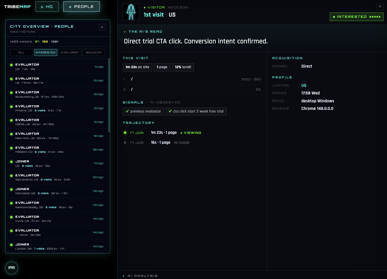
That is the artefact a report cannot produce: one visitor, the pages they read in the order they read them, the conclusion drawn, and the reasoning next to it. The useful part is not the single verdict but what happens when every visitor has one. "62% bounce rate" becomes "these 41 showed real intent, here is what each read, and these 956 were never going to buy." A list you can act on, rather than a number to feel vaguely bad about.
Where they came from changes what the signal means
One more thing changes the reading, and it is the piece most often left out. The same behaviour means different things depending on how somebody arrived.
Two visitors both read pricing twice. The first came from a newsletter you sent to people who already know you. The second clicked something on social while scrolling. The behaviour is identical and the meaning is not, because one arrived warm and with a reason and the other cold and curious. Read them the same way and you will overrate one channel and give up on another too early.
That is why arrival is treated as terrain rather than as a filter. TribeMap arranges every classified visitor into six territories, the six ways people arrive: Search, LinkedIn, Email, Social, Direct and Referral. Somebody from Search had a question. Somebody arriving Direct already knew your name. Somebody arriving by Referral was vouched for. Different starting positions, and the same three page views mean different things from each.
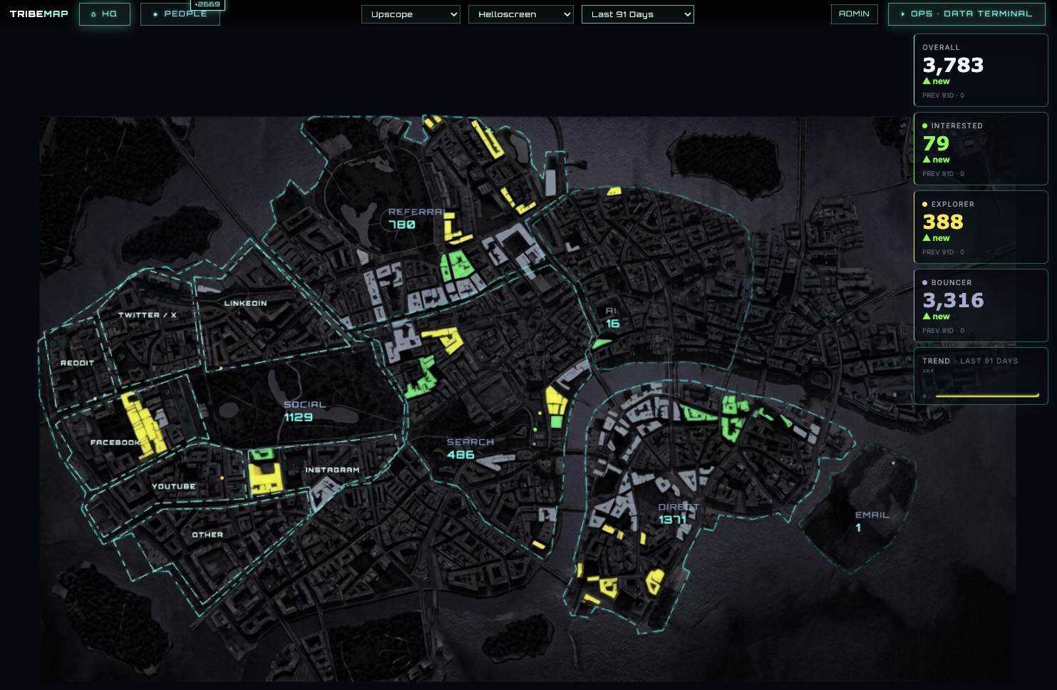
Arranged that way, one comparison becomes obvious without anybody asking. A large territory sending mostly grey is expensive noise however good it looks in a traffic report, and a small territory that is mostly green is worth defending. In a conventional dashboard that comparison is several exports away, a polite way of saying most people never make it. You set the time range, and today updates in realtime.
Underneath it, the job is closing the gap on three things every business is trying to learn about its buyer. WHO converts, which is product and market fit. WHERE they are reached, which is channel. WHAT moves them, which is message. Standard analytics helps with WHERE and can be pushed into saying something about WHAT. It has nothing to say about WHO, because it never looked at anyone.
Setup is one script tag. No personal information is collected and input values are never stored, which is also the answer to whether you need to identify people to read intent. You do not, and you are better off not trying. Pricing is $49 a month, with a 7-day free trial.
How to start reading your own traffic this week
You can make progress before installing anything. In rough order of value per hour spent:
Write down the journey first. The three or four pages a serious buyer would read on the way to deciding, in order, by actual URL. Everything below is easier once you have it, and you will already have spotted a page that should exist and does not.
Look for repeat visits before anything else. The strongest single signal and the easiest to find in almost any tool. If you can see returning visitors at all, look at what they read differently from first-timers. That difference is your intent pattern, in your own data.
Read pricing traffic in context, never alone. What did people look at immediately before pricing, and did they go anywhere after? Pricing then a product page is evaluation. Pricing then an exit is usually a budget answer you did not want.
Compare sources by quality, not volume. Take your two biggest and ask which produced customers last quarter, not which produced sessions. That comparison is usually the most surprising thing here.
Ignore these. Raw session duration on its own. Bounce rate on blog posts, which measures the format rather than the visitor. Total pageviews as a health metric. And any one visitor's story treated as a trend, however satisfying to tell.
Then the caveat that belongs under all of it. A conclusion about a visitor is a judgement under uncertainty, not a fact. Anything reading behavioural signals, a model or you, will sometimes call a serious buyer a browser and be confident about it. That is why a confidence score and the reasoning sit on every classification rather than being buried. Treat one verdict as a signal worth checking and the pattern across hundreds as evidence. For one person the shape is usually readable by the second or third visit. For a conclusion about your business, wait for several hundred classified visitors before you let it move money.
The longer version of why counting and judging are different measurements is in AI analytics vs web analytics. If you are pasting exports into an assistant to get at this, where that approach breaks covers it, and the fair comparison of everything else is in the best AI analytics tools.
Frequently asked questions
What are the strongest signals that a visitor wants to buy?
Repeat visits over several days, time spent on pricing, moving deep into product or documentation pages, and arriving directly rather than through discovery. Any one of those on its own is weak. Together they are a strong pattern.
Does time on page tell me anything useful?
On its own, very little. A long session can be careful evaluation or a tab left open. It becomes meaningful only alongside which pages, in what order, and whether the person came back.
Can I see buying intent in Google Analytics?
Only indirectly. GA4 reports on segments and aggregates rather than surfacing individual journeys, so you can observe that pricing-page visitors convert more often, but not that this particular visitor has now read pricing three times this week.
Do I need to identify visitors personally to read intent?
No, and it is better if you do not. Intent is legible from behaviour alone. TribeMap classifies behaviour without collecting personal information, and never stores input values.
How many visits before I can trust the signal?
For a single visitor, the pattern is usually readable by the second or third visit. For conclusions about your business as a whole, wait for several hundred classified visitors before treating anything as evidence.